is trying to
private chat with you.
Borzoi Items and New Site Artists!
Started By
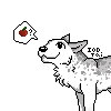
The item art for Carnivale Kennels' new breed, the Borzoi, is finally finished and functional! :D We are still waiting to get caught up on the Thanksgiving items, but it shouldn't be much longer before that's done. Thank you to all of our artists who helped to get everything caught up and completed. <3 If there are any issues with bugs, please be sure to report them on the I Got Bugs!! board in the forums, and they will be addressed. Hopefully, though, everything should be working, and I hope everyone can now enjoy the new breed to a full extent. Thank you all for your patience!
Now, on to the subject of our former main artist/co-owner, Heleasher. I trust everyone has seen the News post regarding this, but I want to make sure everyone knows that she will still be a regular user of Alacrity, so she is not leaving the site forever and you will still see her around. As for what will happen with future breeds and items, Robyn has deemed me as the Official Site Artist, and I will be handling the breed art from here forward. UPDATED EDIT: Maggots has resigned from her position. We still have a great team of artists, including Carnivale, Ehm, Kittybot, GeistNoir, and Wysper! The site art is still in good hands, and you can all expect some great art in the future. :}
_OnikawaSnow (#4624)
profile
message
12-25-2010 at 1:26 AM
i will miss Hel's magnificent art but i do love the borzoi very very much ^^ they have the most beautiful faces :3 but i'm excited for maggots and carnival's additions :3
Maggots (#69)
profile
message
12-9-2010 at 8:51 AM
Thanks for all the comments, guys. The pomeranian will not be added any longer.<br /><br />I do appreciate you guys taking time to critique it, though. (:
.treesong. (#462)
profile
message
12-9-2010 at 3:11 AM
I like it, it's very cute and all, but I think it is a bit to chibi-ish compared to the other art. Also, the muzzle/ears seem a bit too tiny to be noticeable, but maybe that's how they're supposed to be. :/ I still think that I'd buy one or two, but not my favorite breed so far.
Honeyb (#29)
profile
message
12-3-2010 at 9:00 AM
I would love to see the Greyhound, one of my favorite breeds, next to the Aussie, of course. ;)
Grell Sutcliff (#6469)
profile
message
12-3-2010 at 7:41 AM
I kind of agree. I'm not too incredibly fond of it. the muzzle sort of seems to small for it's face somehow and poms don't really go with the whole 'agility dogs' theme.<br /><br />Personally I think a better breed would be the classic greyhound, or, the smaller version of a greyhound called a "Whippet". (My sister has one, wonderful breed) <br /><br />I've also heard that doberman pincers are good breeds for agility as well.
※polander※ HUSKY huskies kennels (#7010)
profile
message
12-1-2010 at 8:18 PM
i guess i like it next can you make rotties i would love it and labs
Abandoned Account (#8060)
profile
message
12-1-2010 at 7:15 AM
Well its cute and everything but... To me it does not really match the other dogs on Alacrity. And if you do make it where i can buy it. I wont be buying it. Other than that its really good!

Welshie (#6474)
profile
message
12-1-2010 at 5:54 AM
It looks kinda cartoonish the eyes to be exact. The fur doesn't really match the ala theme. The snout is pressed in waaayyy too far. The back and the tail pretty noticable the tail is connects with the head fur. The paws don't have much detail either
moriarty (#4059)
profile
message
12-1-2010 at 1:29 AM
It looks amazing but I totally support what merk (and many others) said... It doesn't really fit the Ala style.
And, well, no one draws as awesome paws as Hel :P
And, well, no one draws as awesome paws as Hel :P
edit history
2010-11-30 14:40:54 by #4059
2010-11-30 14:39:38 by #4059
-Aussie (#6922)
profile
message
12-1-2010 at 12:20 AM
*Huggles* It's adorable <3
ΔℓɛϰÏαÑκ-Side (#2449)
profile
message
12-1-2010 at 12:10 AM
Looks cute, but what Merkavich said. Maybe some tutorial's or practice on "ala" style that Hel said she'd post up later will help fit in better? No offense but if this gets posted like the way it is I will feel bad for this site. Oh no I don't have anything against Magg's though D;
Merkavich (#1456)
profile
message
11-30-2010 at 11:52 PM
Personally I like realism, and that looks too cartoonish, it also looks like it was coloured with markers..and if it's a Pom, it's the biggest Pom Ive ever seen. It would look cute as a plush companion though...Also, it would be nice of the future breeds looked good with the backgrounds we have. It doesn't look right when the dog looks like a cartoon, and the background looks realistic. The borzoi looks alright but even that is a lil cartoonish looking in the face for my personal taste, I'm hoping they don't change too much from Hel's style. Although I realize with new artists, the style will change. Hopefully, though it will be for the better.
edit history
2010-11-30 13:23:56 by #1456
2010-11-30 13:22:30 by #1456
Ante (#39)
profile
message
11-30-2010 at 11:18 PM
Congrats, you guys! You both do awesome work. =)<br />Love the pom, but I do agree the eyes pop out a little too much. Maybe if the lines are dulled down a bit? I'm not sure, but otherwise it's lovely ^^
Nachtbringer (#3757)
profile
message
11-30-2010 at 2:20 PM
I've never seen a Pom up close nor been interested in the breed (I'm a big dog person) so I can't point out anything useful here, but I believe others have given enough critique to work with already. c:<br /><br />However, I don't think the coloring fits Alacrity - it's too digital. I love the traditional look Hel brought here. Most artists do digital art these days so everyplace also has its art that way, but I've always preferred traditional art more. And that's how Hel's breeds and items here have looked: as if they had been done on paper, with a pencil, colored pencils and/or watercolors. The hues used have been what you'd get from those, not the bright ones you'd get straight from Photoshop or somesuch. Also loved how sketchy Hel's art always was, it wasn't all cleaned up and finished like how all people tend to do it. In my opinion that was what made Alacrity different. My GSD Hewie is a good example on this: the fur is full white so you can see all the detail and pencil-softness on it and its lines, and the white fur really shows that a natural/soft hue was used, not the bright basic one on snow and copying paper.<br /><br />This is also why I'm not caring for the Borzoi much. I do understand that people have different styles so I'm not telling them to go and imitate how Hel draws. Style differences are perfectly fine, and we're bound to get used to them once more breeds from more people start coming out. But I really wish the colors would be worked on more and kept the same, to make Ala's charm remain. The lineart on the Borzoi and Pom is darker than on the old breeds, thus making them stand out and not fitting most of the backgrounds as well. They don't blend in like the others. The eyes always had a more pastel hue, not bright and highly notable like now.<br /><br />Black wasn't pure black, white wasn't pure white. No hue was overly bright. The lineart was more grey than it was black. I've loved watching that kind of dogs here, I wish I still can in the future.

Leekar (#91)
profile
message
11-30-2010 at 10:21 AM
I'm with SA. =/ Hel's style is what pulled me back into Alacrity. The new artist are great, don't get me wrong. I appreciate their hard work in what they've done already! It's just not the art style I fell in love with. xD I love the realistic look to everything.<br /><br />I agree that the Pom's face needs changing, as someone mentioned it does look to anime and cartoon like. And over all pixelated.<br /><br />I might just be biased because I miss Hel's art already. ;-;<br /><br />
Sad Artist (#406)
profile
message
11-30-2010 at 7:47 AM
Hm. I miss Hel already. Sorry if this came out rude, but there is something magical about her style. Its airy, and light, and overall different. Different enough to make alacrity very popular and make the users fall in love with the site.<br /><br />Not saying that new artists are bad. They are just different, not in the way I prefer it though. <br /><br />I will miss Hel's touch. Honestly, I think it was her art that made alacrity... alacrity. Well, I guess we shall see where the new changes will take us.
Three Whispers (#7424)
profile
message
11-30-2010 at 3:29 AM
About the drawing - <br /><br />Like many of the others, I didn't realize it was a pomeranian until I saw the comments. I can't stand pomeranians and wouldn't have any on Alacrity, but I used to work in a pet store that sold pomeranians and I'm really familiar with them.<br /><br />I think it needs more fur everywhere. Its legs seem too long, but I think it's just because I'm so used to seeing the leg length lost in so much fur. Also pom tails are supposed to lay flat on the back, according to AKC (and most other kennel club) standards at least. <br /><br />Overall, the style matches Alacrity really well! Great job!
illusions of dreaming (#6174)
profile
message
11-29-2010 at 3:48 PM
First of all~ Congratulations Maggs~ Your art is miraculously beautiful and I think you definitely earned the title of being an artist! Unlike me a lazy butt who broke her own tablet. XP<br /><br />And I must admit your art is amazing and cute! You do draw with a mouse right? or was it a touchpad, whichever it was its amazing both ways. <br /><br />Now, some harsher critiques on your picture. I'd second ☣Клейтон☣ comment, I didn't know it was a pomeranian until I looked at the comments below. And whilst it's cute, its a bit out of place in Alacrity. Alacrity after all is a realistic dog adoptable site, and this pomeranian is too cute XD<br />the head might look a bit too fuzzy and curly as pomeranians own softer straighter hair shown in ☣Клейтон☣ reply.<br /><br />The eyes. Another problem. It's too .. well googly? or too cute XD.<br /><br />but overall a very nice picture. But i don't think this would fit in Alacrity Dx sorry. It looks really lovely though! I'm sure you're producing more and more of these beautiful pictures and getting better each time! Keep up the good work!
edit history
2010-11-29 04:49:47 by #6174

Steaks (#5484)
profile
message
11-29-2010 at 2:31 PM
I'm going to be fully honest. I didn't know which breed this was until looking at the comments. This could possibly be because of the fur colours [I'm used to seeing Pomeranians as orange/yellow] or because the fur around the face looks too "thick". I though this was some kind of Spitz or something at first. Maybe if longer fur were added on the underbelly, around the neck, and ESPECIALLY on the tail, I could see it. The tail here looks too distinct, which is probably why I got a "Spitz" at first glance. <br /><a href=http://www.dogsindepth.com/toy_dog_breeds/images/pomeranian_h01.jpg rel=nofollow>Tail 1</a><br /><a href=http://animal-world.com/dogs/Toy-Dog-Breeds/images/PomeranianWDTo_ApF6.jpg rel=nofollow>Tail 2</a><br />Either way, very cute! I look forward to seeing new artists' breed art c:

ZJ (#1511)
profile
message
11-29-2010 at 10:53 AM
It's very nice overall, but the eyes are frankly completely unrealistic. It's too cartoony.<br /><br />My other concerns are size, in comparison to the other small dogs on the site, as the size of the dog seems to correlate with the other dogs, the Pomeranian is too big. It's more the size of a medium sized dog than a small dog.<br /><br />My last worry is the art seems to not match up with the other dog art, the style is less defined and more soft. I think a few adjustments could be made to fix this.<br /><br />Obviously not all the art can be exactly the same and of course it's easier to critique than draw, but while it's a cute pom, it doesn't feel like an alacrity pom yet. It feels like it's very close to it though. And obviously hard work went into it, so I don't mean to be such a downer. I hope you don't take this as a criticism but rather as suggestions to improve to relate this dog to the others on the site.